A Day In The Sun Newsletter, S3 V1
Musings with a dash of bluster at the intersection of brands, creativity, and entrepreneurship
[About a 4 minute read; 2 if you skim; 0 minute read if you blow it off entirely]
→ What awesome new brands are the apples of your eyes? Reply and let me know… (“New” = “five years old or younger.”)
Remember when I wrote (ha ha ha ha… I’m snickering) in the last newsletter I released (he he he he he) that I was going to publish (snort, cackle) shorter newsletters, every month or so? (I just did a Danny Thomas spit take). Well, that last one was longer than a Dostoyevsky book… and it was 10 months ago. (Sigh). This time, however, I am really going to try it. Actually.
First, a notice: Expo-a-gogo
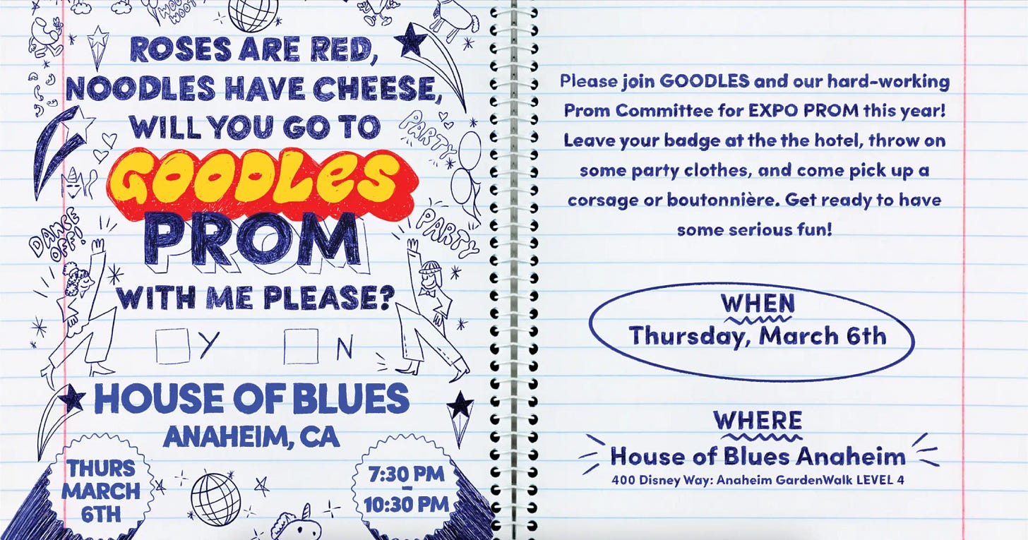
I’m packin’ my bags for Expo West and if you are too, let’s connect. I’ll mostly be with my friends and colleagues on the truly amazing GOODLES crew, who have put together another bonkers booth and even more bonkers (bonkerser?) party on Thursday night. Party theme: The Prom. I’ll be wearing a lime green tuxedo with ruffled shirt. Actually. Be there or be square.
1. OBSERVATIONS FROM THE BRANDVERSE
DGAFness
Bella Hadid is smoking in public again. Carl’s Jr. has brought bikini models back to its advertising. The provocative new David bar just wants you to achieve max-plus protein, regardless of how you get there… no virtue signaling, you pansy. Like it or not, it’s our job to read this room. It’s a different world out there, and not just because of the sociopolitical changes afoot. In fact, I’d argue that DGAFness is a tail wagging the dog…
Postscript: I am not related to Alix Earle, the “Influencer” x Carl’s spokesmodel above. Although what’s wild is that I have a quite awesome aunt named Alix Earle… and that’s how she spells Alix. It’s atypical, as is the spelling of our shared surname.
It’s alive! (Except, it isn’t)
One of the toughest barriers to real innovation inside corporate labs is the reflex to conjure up these humungous “global growth spaces” comprised of a zillion different macro trends pulled out of a syndicated research deck somewhere, and mashed together. Tantalizing! “If we carve out a mere 1% of this $900 trillion category…” Okay, except that these “Frankencategories” don’t actually exist… and in all likelihood, never will. At least before we all retire.
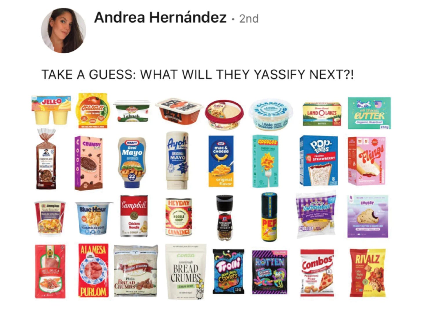
I prefer a much simpler approach: Yassification.
I define “Yassify” as, basically, reworking an existing thing into a form that is more attractive, more relevant, improved. As a strategy in consumer product ventures, it works great if you do it right. Nice post by Snaxshot here, and good to see GOODLES mentioned. If I were running a corporate studio, I’d just look for big categories with big incumbents that are asleep at the wheel, then figure out how to do what they do, way better.
Rope-a-dope
A number of LinkedIn posts, a Fast Company article, and buzz trackers everywhere are hyping a new term called “Dopamine Design”: bright wild colorful gonzo packaging, looney type schemes, maximalism on the march that hits the frontal lobe. GOODLES is frequently cited in this context, also. Many of these Lizard-brain designs were created as antidotes to the “blanding” craze of the mid-late 20teens… ya know, all the matte earth tone negative space and logos that are just 7 pt. Helvetica. Where do you think the “Dopamine” design trend is in its life cycle? And, what will follow?
Dumb it down
I was enjoying a belt with my buddy and oft-creative collaborator Dan recently. Dan is a really smart guy, and by that I mean, possesses a super high IQ (certainly besting mine). He raised a fascinating challenge that I hadn’t ever previously contemplated: as a creative, can you sometimes nail it by crafting something… stupid? I have written before that many of the best ideas ever are a little bit weird. I will add this as a wonderful adjacency: many great ideas are a just little bit dumb. Beautifully doing “dumb” is a very sophisticated act and, ironically, smart. A lot of the great comedy writers have mastered this, for example. And they all had/have genius-level intellects.
Hire these guys? That’s not the point!
Aisle pass
A design company touting their revolutionary new first class seating scheme the other day really set me off. Don’t call this a “window seat.” Because, dammit, it isn’t. Anyone who is a fanatical window seat loyalist, like I am, can tell you why instantly (spoiler alert: unless you crawl over the desk, you can’t look out the window). The point: know your audience!
Who are you, who who?
If this is the net effect of how you appear on shelf, you’re in big trouble.
Sweat the small stuff
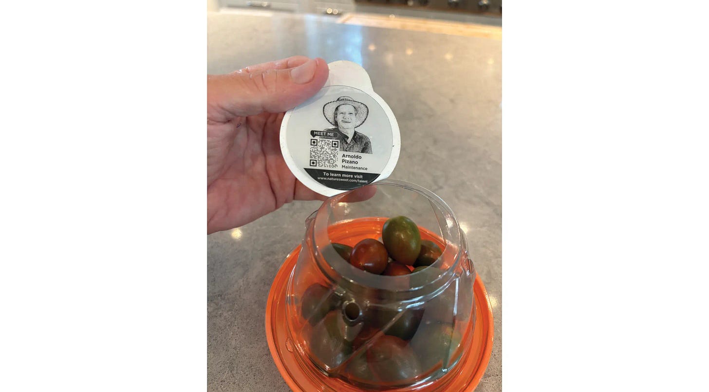
Details details details! Nature Sweet took the care and time (and invested the money!) to print a photo of a team member on the inside of the top flap of this tomato container. I was quite surprised and delighted to discover this small but mighty touch. It actually made me happy. “Oh, look at that!” I instantly felt closer to the brand and the people behind it. Good for them. We need to pay much more heed to small details like this. They can be huge.
Back to the future
There’s a trend across professional sports of teams trotting out “throwback” uniforms, often from the 1970s and 1980s. The default assumption as to why: nostalgia, news, and another jersey you can buy (cha ching). I accept all that, but will offer another reason: they are just… awesome. In the example of two of Philly’s teams below, I would argue that these infrequently-worn “throwback” unis are aesthetically superior to their contemporary everyday ones. As a design community, we can sometimes look forward by looking back.
This Rocks
I had the chance to host my new friend David Rockwell, the world-famous architect, at a Northwestern/Kellogg conference that I co-created (more on that below). In hanging with David before the show started, I happily received a complimentary copy of his book DRAMA. What a title! And I gotta say, these guidelines for creative excellence are the best I have ever seen. Aside: David might be as good at book concepts and titles as he is at designing spaces: he has another book called PLEASURE.
Ya gotta laugh (if possible)
Remember when Covid first emerged, we heard practically every statement prefaced with “in these daunting and uncertain times,” or something to that effect? Well, it feels like we’re there again, just for a different reason. Today, I think it’s important to find humor in as many things as possible, as often as possible. This belief has implications for us as professionals, too. This joke below, from the Saturday Night Live anniversary special, is really funny. Thank you, Steve.
2. INSIDE THE ROPES (OR: “DESIGN THINKING DOING”)
In the form of a question: “What is a rocket ship?”
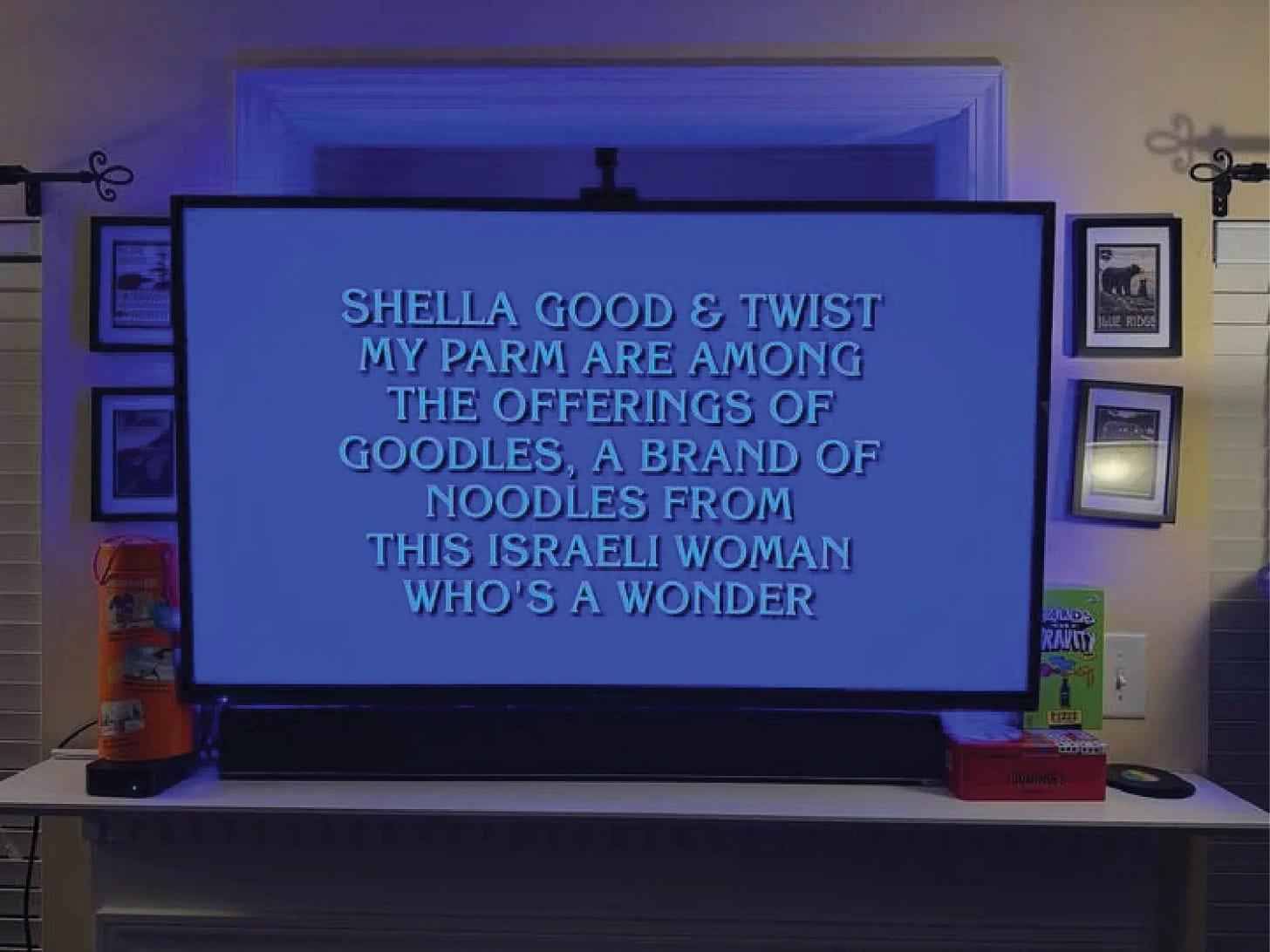
GOODLES continues to amaze. I have never seen business growth like this in my career, nor have I ever seen such fan enthusiasm (the two are related, of course). 2024 was a banner year, and we know that 2025 will be even better, as we are now breaking monthly sales records… every month. Lots of really unusual things are starting to happen organically, regularly. Here’s my favorite lately: we were just on the TV show Jeopardy. Wait, what? We had absolutely nothing to do with placing this, and learned about it only because a team member randomly happened to be watching.
Kate the great
Big Nose Kate western whiskey continues to show major promise. For starters, big news for big nose: we brought on Kim Nocella, a well-known spirits industry rock star, as Chief Commercial Officer. Kim’s positive impact on the business has been immediate and material. We have a few stunning new products in the works that we believe are going to sell out just on pre-orders, new accounts are coming in regularly, and the fan base is energized and growing. The company is going out for another capital raise soon. Hopefully Kate is cheering all this from the saloon above. If she has Instagram up there, she may also be laughing… at Melissa McCarthy’s holiday video.
S’wonderful
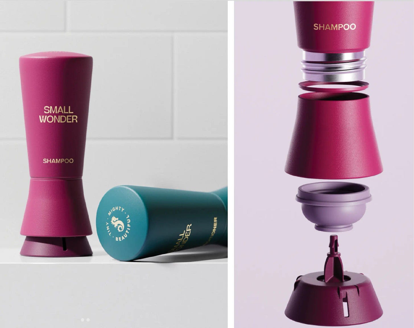
Small Wonder powder-to-lather shampoo (and now conditioner) will need a big trophy shelf for all the awards rolling in. Our breakthrough patented dispensing vessel won a prestigious ISDA “IDEA” award for design excellence; we were named “Best new shampoo” at Cosmoprof 2024; and earned recognition from Marie Claire for “Best Refillable Packaging” in 2024. This wonder is a winner: it works incredibly well because the concentrate is not cut with fillers and other crap in the legacy shampoos; the magical transformation from powder to lather makes it fun to use*; the bottle is beautiful and cool; and there is no wasteful single-use plastic or pre-packaged water. Now, the challenge is simple: persuade people to give it a try. That’s quite a tall order, but if we can do it, look out.
*I pitched the team on this line: “Small Wonder: the second most fun you’ll ever have in the shower.” This line was quite swiftly rejected, but I’ll try again later.
Designing “By Design”
Gordon Segal, the Crate & Barrel cofounder and a Trustee at Northwestern, had a beef: Kellogg MBAs were going out into the world with these elite degrees and expectations to be future leaders, but most had next to zero (or exactly zero) experience with design processes and creative people. So we created “By Design: Unlocking the Creative Advantage,” an immersive study (and celebration) of the powers of design. We staged our second program on February 19, featuring superstar speakers like the architect David Rockwell, designer and art director Lewis Williams, and my GOODLES partner Jen Zeszut. I had the honor of being host and MC. The main auditorium was packed to the rafters, and by all accounts the event was a smashing success. More to come, I think. Thanks to Agency EA for being an awesome partner in producing all this.
Bat phone: operational
I deeply care about my partners on the venture front, extraordinary people who are working so hard. I love them, and would do anything for them. That’s where a ton of my time is going these days. I do, however, continue to selectively engage with clients who need a “very particular set of skills.” Some undertakings over the past six months or so have included creating a new brand from scratch for an exciting startup led by a few ringers from the personal care space; coaching a few teams endeavoring to create new products and brands inside a big company; and a few workshops and keynotes on the state of consumer product innovation in 2025.
That’s a wrap for now. As we roll into the spring, here’s a suggestion: any time you’re worried about the news, turn it off, and vector your energy to new brand or product ideas for a minute. Easier said than done.
There will also soon be the emergence of flora and fauna, perhaps an even better distraction.
As George Harrison wrote: “Here comes the sun. It’s alright.”
It's alright!
Get in touch:
A Day In The Sun
909 Davis Street, 5th floor
Evanston, Illinois 60201
Paul@ADayInTheSun.com










An excellent illustration of brand renovation through Dopamine Design is Popchips. The brand was struggling to keep up and was becoming less relevant in the market. In its attempt to align with "Better For You" trends, Popchips shifted to a predominantly white packaging, which diminished its original "pop" and distinctiveness.
In 2021, we intervened with a redesign that restored the brand's vibrant identity. This strategic revamp led to significant growth in velocity and an increase in market share.